
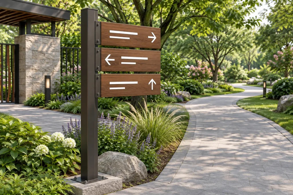
Wood-grain wayfinding can suit a landscaped setting while retaining the structure of a fabricated sign. Its success still depends on the directions being easy to find, read and maintain. Treat the graphic content, structural frame and decorative finish as separate decisions. A natural-looking surface does not by itself establish durability, accessibility or a suitable installation method. The useful brief describes the route, viewing conditions and complete sign construction.
Begin with the decision points
List where visitors must choose a direction rather than starting with a decorative panel shape. Record the approach direction, viewing distance and surrounding visual clutter. Keep destination names consistent across the site so one location is not described in several different ways. A map of decision points helps determine which signs need to be seen together and which information can wait until the next junction, reducing unnecessary text on individual panels.
Keep graphics and structure distinct
Specify the panel or frame material separately from the wood-grain appearance and graphic method. The supporting metal, finish and replaceable information elements may have different maintenance needs. For custom pylon and wayfinding signs, identify the complete format and mounting proposal. Ask which surfaces carry the decorative finish and how edges, joints and graphic panels will look. Do not use the appearance of timber as evidence that the construction behaves like timber.
Protect legibility from the decorative pattern
Review the lettering against the actual finish sample. A pronounced grain can compete with fine strokes, particularly when viewed at an angle or under uneven light. Use a restrained graphic layout and check glare, contrast and character clarity. The U.S. Access Board’s signs guide explains visual-character requirements for signs within its scope. It is a useful reference, but the applicable project requirements must be checked; a material choice alone does not make a sign compliant.
| Planning layer | What to decide | Approval material |
|---|---|---|
| Route information | Destinations, arrows and consistent names | Site wayfinding schedule |
| Graphic design | Characters, spacing, contrast and information order | Scaled artwork and viewing trial |
| Structural format | Post, frame, panel and mounting proposal | Dimensioned drawing |
| Decorative finish | Grain direction, color and visible edges | Physical finish sample |
| Maintenance | Cleaning, graphic updates and access | Agreed service approach |
Review the finish in the landscape
A sample viewed indoors can look different against vegetation, paving, stone or a shaded entrance. Place a representative panel at the planned viewing point where practical. Include likely daylight, reflections and seasonal surroundings in the review. If separate non-illuminated metal signs are used for building identities or nearby destinations, coordinate their naming and visual hierarchy without assuming every format needs identical dimensions or a matching mounting arrangement.
Choose information density deliberately
A directional panel should help a visitor make the next decision. Group related destinations, use a consistent arrow system and avoid filling every available surface. Accessibility Standards Canada’s wayfinding and signage material provides official context on legibility, placement and visual consistency. For a commercial site, custom logo signs can identify the main arrival point while directional units guide the route; those functions benefit from coordinated design but are not interchangeable.
Plan for future changes
Destinations and routes can change after the installation. Discuss whether graphics or panels can be updated, how replacement references will be retained and who will clean the signs. Keep the approved finish sample and artwork revision with the site schedule. Ask the manufacturer about the specific construction proposed for the environment rather than treating a wood-grain finish as a universal guarantee of weather resistance or a fixed service life.
Frequently asked questions
Is a wood-grain metal sign automatically suitable outdoors?
No. Suitability depends on the complete material, finish, graphics, mounting and exposure. Confirm the intended environment and the proposed construction rather than relying on appearance alone.
Can the grain pattern reduce readability?
It can compete with lettering, depending on contrast, scale and viewing conditions. Review the actual finish and artwork together at the intended distance and under representative light.
Does this type of sign automatically meet accessibility rules?
No. Accessibility depends on the applicable requirements and the finished sign’s design and placement. Review the relevant standards for the project’s jurisdiction and sign function.
Plan your sign with HLW Sign
Share the site plan, destination list, intended locations and a preferred finish sample. We can discuss a coordinated wayfinding construction and artwork proposal for review. Send your project details to discuss a suitable construction and quotation.