
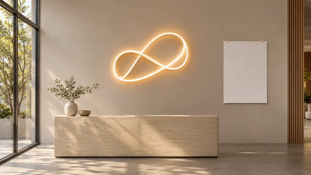
The best neon sign size is not a fixed percentage of a wall. It depends on the usable area, the shape of the logo and the positions from which it needs to be understood. A long script word and a compact symbol can have the same overall width while producing very different visual weight. Start with the actual installation rather than a generic online size chart.
Measure the usable area
Record the boundaries that matter: furniture, window frames, doors, shelves, curtains and any support structure. A large wall may contain only a modest clear area once these features are considered. For a window, distinguish the glass opening from the part visible through frames, displays and reflections. Mark the proposed sign position on a straight-on photograph with at least one reliable measurement.
When reviewing custom neon light signs, include the overall backing dimensions as well as the illuminated design. Depending on the construction, the backing, suspension hardware or cable entry may extend beyond the visible lettering. A logo that fits on screen may therefore need more physical space than its lit outline suggests.
Check letter proportions, not only total width
Overall width is convenient for quoting, but it does not explain the smallest important features. Look at the height of ordinary letters, the narrowest strokes and the spaces inside connected script. A wide logo with small secondary wording may still be difficult to read. Ask the manufacturer to review the production geometry at the proposed size rather than scaling every part of the artwork without discussion.
The Sign Research Foundation’s legibility and visibility resources describe how size, placement and viewing conditions interact. For an interior logo, use that principle to test your own setting. Do not borrow a roadside distance formula and assume it predicts the right appearance above a reception desk or within a window display.
Use a location-specific sizing worksheet
| Location | Measure or test | Common oversight |
|---|---|---|
| Feature wall | Clear area above furniture and normal viewing positions | Using the entire wall width |
| Window | Visible opening, frames and competing reflections | Ignoring displays or mullions |
| Photo backdrop | Intended framing and people positioned in front | Letting the logo disappear behind subjects |
| Reception area | Standing and seated sightlines | Testing from only one eye level |
| Temporary display | Backing, support and cable space | Measuring illuminated strokes alone |
Make a full-size paper mockup
A paper outline or temporary non-damaging marker can reveal proportion problems more clearly than a small rendering. Place the mockup at the intended height and inspect it from the entrance, the usual viewing position and any oblique approach. Include the backing outline. If the sign is part of a photo backdrop, position people or stand-ins so the relationship between the logo and the composition can be reviewed.
A mockup is an approval aid, not a guarantee of illuminated appearance. Light output, color, the background surface and surrounding lighting affect the result. Request an appropriate visual reference or sample where those details are important. Record the approved overall dimensions so later production discussions do not reopen a size decision based on a different image scale.
Coordinate alternative sign constructions carefully
Sometimes the first size review shows that the desired wording contains details that are difficult for the preferred construction. Ask about a revised layout or another product before simply making everything larger. Compact acrylic illuminated letters may suit some fine-detail identities, while backlit logo signs offer a different visual effect on suitable wall surfaces. The aim is a workable design, not a forced one-to-one replacement.
The USSC Foundation on-premise sign guidelines provide broader research context for visibility. Apply external guidance with attention to its intended setting. Your own installation should still be reviewed using its actual geometry, lighting and operating requirements.
For a window installation, repeat the mockup review under different daytime conditions. A position that works against a shaded interior may look less clear when reflections become stronger. Record the intended operating hours so the team understands which conditions deserve the most attention.
Frequently asked questions
Should a logo always fill the available width?
No. Surrounding space, the design’s proportions and nearby objects influence the balance. Test a mockup rather than automatically choosing the largest possible sign.
Can I approve size from a phone rendering?
A rendering is useful, but its scale and viewpoint can be misleading. Include measured dimensions and review a full-size outline when proportion is critical.
Do I need to include the backing in my measurements?
Yes. Confirm the complete supplied assembly, including the backing and relevant mounting space, so the product fits the intended location.
Send HLW Sign a measured installation photo and your preferred artwork to discuss a practical size before production.