
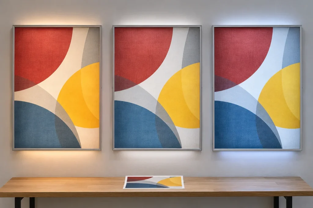
A printed graphic is not experienced independently of its light source. The artwork, print process, diffuser and LEDs work together to create the visible result. Choosing a Kelvin value from a list can begin the discussion, but it cannot establish exactly how a particular brand color or photograph will appear in the finished lightbox.
When planning store signage, use the actual production graphic or a representative test section wherever practical. A sample built around unrelated artwork may demonstrate that the lightbox illuminates, while leaving the important color-approval questions unresolved.
Separate white-light appearance from color fidelity
Correlated color temperature, usually described as CCT, summarizes an aspect of the apparent color of white light. It does not provide a complete description of the source spectrum or the appearance of every illuminated color. The U.S. Department of Energy explains that CCT is more informative when considered alongside other color information, and its LED color guidance notes that sources with the same headline values may render colors differently.
This is why a request for a particular CCT should be accompanied by a visual approval process. A neutral-looking white background does not guarantee that every saturated printed color will match the buyer’s expectation. Separate the desired white-light tone from the question of how the actual graphic performs.
Build a sample that answers the real question
Include the production print material, the intended diffuser and the proposed LED arrangement in the review. If the complete graphic is too large for an initial sample, choose a section containing the colors and details most important to the project. Explain what the smaller sample represents and what can only be assessed in the complete assembly.
For an illuminated business logo, the important issue may be a brand color against a white background. A photographic advertisement may need a different discussion about skin tones, dark details or contrast. Do not assume one attractive sample settles both tasks. Review the content that the actual display is intended to carry.
| Approval question | What to include | What to record |
|---|---|---|
| White-light tone | Proposed production LEDs | Exact component reference and agreed appearance |
| Printed colors | Representative production graphic | Approved sample and revision |
| Light distribution | Diffuser and intended construction | Observed uniformity under consistent conditions |
| Site appearance | Expected ambient light and viewing direction | Location notes and comparison photographs |
| Replacement graphics | Same agreed material and print specification | Supplier and production records |
Control the viewing conditions
Look at the sample in a setting that is relevant to the installation. A lightbox viewed in a dark room can appear very different from one surrounded by daylight or brightly lit retail shelving. Discuss the normal operating environment and assess whether the graphic remains readable from the expected distance and approach direction.
Use consistent camera settings when requesting remote comparison photographs. Automatic exposure and white balance can change the apparent difference between samples. Photographs remain useful records, but they are not substitutes for a controlled physical comparison where exact appearance is important. Identify which decisions can be made remotely and which warrant a sample review.
Compare related signs without assuming identical construction
A store may combine a graphic lightbox with a backlit logo sign or compact acrylic illuminated letters. They need not use identical internal parts to belong to the same visual identity. Instead, discuss the intended relationship: similar white-light tone, compatible brightness or an intentional contrast between the signs.
Approve those relationships explicitly. Two separate sample photographs taken in different rooms can make a comparison difficult. Where practical, review the proposed signs together or use a consistent reference process. Keep the resulting comments attached to the corresponding product and artwork revisions rather than relying on a broad request to make everything match.
Preserve the reference for later orders
Record the approved graphic material, print revision, LED reference and diffuser arrangement. Keep an agreed reference sample where the project warrants it, particularly for repeated locations or replacement graphics. A future order described only by size and a Kelvin number may not reproduce the same appearance if other parts of the system change.
There is no single best CCT for every lightbox graphic. A stronger approval asks how the complete sample looks under the intended conditions and records the components that produced that result. That approach gives the buyer and manufacturer a practical reference for both the initial display and future updates.
Frequently Asked Questions
Does a higher Kelvin number automatically mean better graphics?
No. CCT describes white-light appearance, not a universal quality ranking. The graphic, print material, source spectrum and viewing conditions all contribute to the result.
Can two LEDs with the same CCT make colors look different?
Yes. CCT is a summary measure and does not fully describe the source spectrum. Review a representative physical sample where the exact appearance matters.
What should be retained for replacement graphics?
Keep the approved artwork and print-material references, along with the relevant LED and diffuser information. Record any agreed sample and the viewing conditions used for approval.
Technical References
U.S. DOE LED Color Characteristics; U.S. DOE Color and Spectrum.
Discuss Your Project
Share your artwork, approximate dimensions, installation location and delivery country with HLW Sign. Contact our team for a project-specific review and quotation.